
By Styora Decors | Interior Styling & Decor | 9 min read
Every room looks fine on its own. Stand in the doorway, though, and the house feels like four different flats stitched together.
A good colour combination for home is not one palette per room. It is one calm base colour that runs through the whole house, one accent that travels from room to room, and a single extra colour that belongs to each room alone. Get those three layers right and the living room, dining area and bedrooms feel like one home, even when each looks different.
This guide shows how to build that whole-home palette for Indian homes, how to judge it in your own light before you buy a litre of paint, and eight combinations that flow. One honest note: repainting needs a painter. Most of what follows is pure styling with cushions, curtains, rugs and art, with no renovation at all.
Why a whole-home palette matters more than any single room
In most Indian apartments you rarely see one room at a time. The entrance opens onto the living room, the dining table sits in the same hall, and a bedroom door frames a slice of the corridor. Your eye reads all of it together, so a mint living room next to a maroon dining wall and a grey bedroom feels busy, even if each colour is lovely on its own.
Room-by-room guides, including our own colour combinations for the hall and bedroom colour combination ideas, go deep on one space. This post is the step before those: deciding what stays the same everywhere, so each room has something to connect back to.
The three-layer rule: base, thread and room colour
The 60-30-10 rule (60% main colour, 30% secondary, 10% accent) is the usual way to balance one room. Across a whole home it works best as three layers:
1. The base (roughly 60%)
One neutral family for walls, ceilings and big surfaces in every room you can see from another: warm white, off-white, greige, a soft beige. It does not have to be the exact same shade everywhere, but it should be the same temperature, all warm or all cool. Mixing a cool bright white in the hall with a creamy white in the dining area is one of the most common reasons a house feels slightly off without anyone knowing why.
2. The thread (roughly 30%)
One accent family that appears in every room in a different strength: sage green as cushions in the living room, a deeper olive in the dining chair fabric, a pale green bedcover. The thread is what makes the home feel planned. Wood tone can be your thread too, if the furniture is mostly one finish.
3. The room colour (roughly 10%)
Each room gets one colour of its own, in small doses: rust in the living room, mustard in the kids’ room, dusty pink in the guest bedroom. Because the base and thread already tie things together, these pops read as personality, not chaos.
✨ Stylist’s tip
Plan the palette from the doorways, not the rooms. Stand at your main door and in each bedroom doorway and take a photo looking out. Whatever colours show up together in one frame must work as a set. That is the view you and your guests actually live with.
Read your light before you choose any colour
The same shade card colour can look completely different in two rooms of the same flat. Three checks explain most of the surprises.
Which way the windows face
Paint companies and colour consultants broadly agree on this. Rooms that get mostly indirect light, often north-facing ones or flats shaded by the next tower, receive softer, cooler light, which pushes cool greys and stark whites towards dull and flat. Warm whites, beige-based neutrals and warm-toned versions of the colours you like (a warm grey instead of a blue-grey) hold up better there. Rooms flooded with direct sun are forgiving with most colours. Their risk is glare and heat, which soft blues, pale greens and other cooler tones help calm.
LRV: the number on the shade card that matters most
Many paint shade cards and colour tools list an LRV, or Light Reflectance Value, on a scale of 0 to 100: how much light a colour bounces back, from black at the bottom to pure white at the top. Real paints sit between the extremes. If a room is dim, a higher LRV makes it feel lighter. If you want a cosy, enclosed feel in a den or a reading corner, a lower LRV gives you that. Comparing LRVs is the quickest way to know whether a colour will look lighter or heavier on the wall than on a tiny swatch.
The bulbs you switch on at night
Indian homes spend their evenings under artificial light, so a palette has to work at 9 pm too. Warm white bulbs are usually around 3000K; cool daylight bulbs are often 6500K. Warm light flatters beige, terracotta and wood; cool light sharpens whites and blues and can make warm neutrals look slightly yellow. Packaging labels in India are not always consistent, so check the K number on the box rather than the word “warm”. Keep one colour temperature across rooms that see each other, and read our guide to layering lighting through the home for the rest.
8 colour combinations for home that flow room to room
Each one lists the base, the thread and a room colour for each main space. Treat them as starting points and adjust the strength to your light.
1. Warm white, sage and rust 🌿
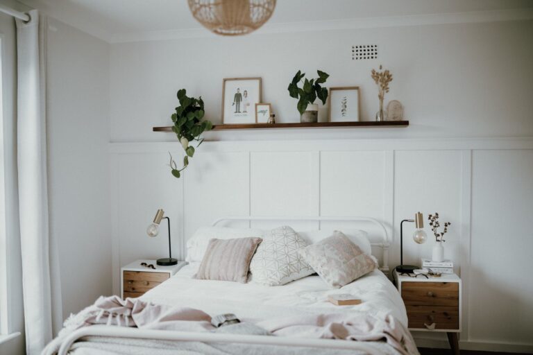
Base: warm white walls. Thread: sage green (living room cushions, dining runner, bedroom throw). Room colours: rust in the living room, ochre in the dining area, dusty rose in the bedroom.
2. Greige, navy and brass
Base: greige. Thread: navy (a rug, dining chair seats, bedroom curtains). Room colours: brass and mustard in the living room, white-and-blue block print in the bedroom. Works well in sunny flats where navy cools things down.
3. Ivory, terracotta and cane
Base: ivory or soft cream. Thread: terracotta (planters, cushions, a clay lamp base). Room colours: olive in the living room, natural cane and jute in the dining area, peach in the bedroom. Very warm, ideal for north-facing or shaded homes.
4. Off-white, charcoal and wood
Base: off-white with a warm undertone. Thread: charcoal (a sofa, picture frames, bedside lamps). Room colours: walnut-toned wood throughout, with one teal or forest green per room. A clean, modern scheme that hides city dust better than all-white decor.
5. Beige, olive and cream
Base: light beige. Thread: olive (curtains in the hall, a bench in the foyer, cushions in the bedroom). Room colours: cream bedding, brown leather, a single deep red artwork.
6. Soft white, powder blue and sand
Base: soft white. Thread: powder blue (sheers, ceramics, a bedcover). Room colours: sand and linen in the living room, a white-blue printed tablecloth in the dining area. Light and airy for compact flats in hot cities.
7. Cream, emerald and gold ✨
Base: cream. Thread: emerald (a velvet cushion set, a dining centrepiece, a bedroom armchair). Room colours: gold and brass accents, maroon for festive weeks. Rich without being heavy; it also carries Diwali decor beautifully.
8. Warm grey, blush and black
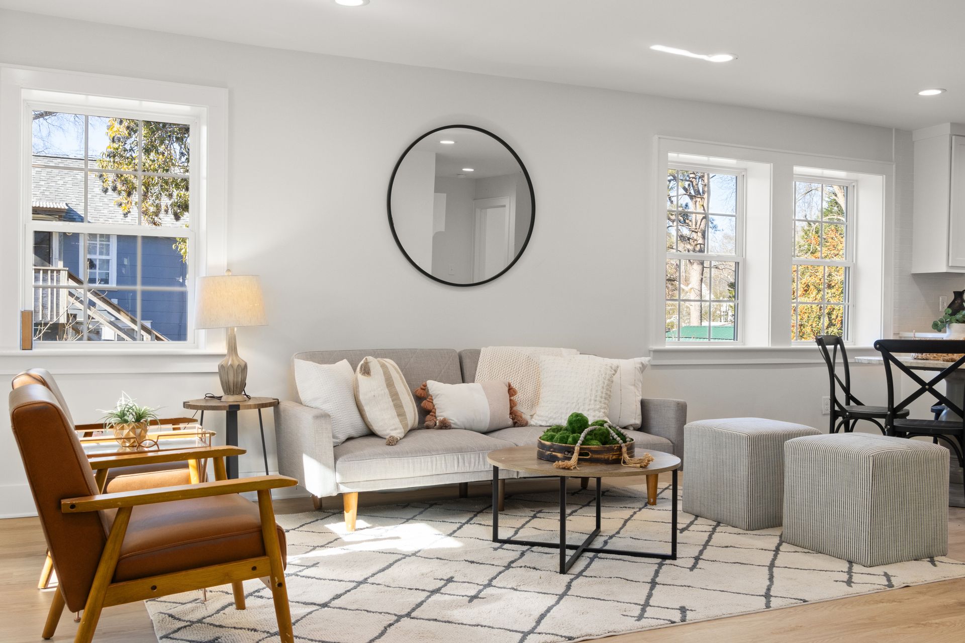
Base: a warm grey or greige. Thread: blush pink in small doses. Room colours: black metal frames and lamps, white bedding, a charcoal rug. Quietly stylish and works in rentals where walls stay landlord-white.
How to change your home’s colours without repainting
Most renters, and many owners, cannot or do not want to repaint. The good news: the walls are only part of the palette you actually see. A sofa, curtains and one large rug usually cover more of your field of view than any single wall.
- Curtains are the biggest movable colour block in most rooms. Change these first.
- Rugs anchor the floor colour and tie the furniture together; a rug can carry the thread colour across an open hall.
- Cushions and throws are the cheapest way to test a room colour for a season before committing.
- Art and frames repeat a colour at eye level; one print in the thread colour in each room links the house.
- Bedding sets the bedroom palette almost single-handedly.
- Plants, ceramics and brass add green, earth and gold that sit happily with almost any base.
If your sofa is the colour that decides everything, start with our sofa colour combination guide and build outwards from it.
If you would rather have a stylist build the palette around what you already own, that is exactly what our interior styling & decor service does: no painting crew, no carpentry, just the right pieces in the right places.
How to test a colour combination at home
- Buy sample pots or tester sizes and paint a large card or a patch roughly A3 size, not a thumbnail.
- Put the sample on two walls in the same room, one that gets light and one that does not.
- Look at it in the morning, mid-afternoon and at night under your own bulbs. Many colours change most after sunset.
- Hold fabric swatches, a cushion or a rug corner against it. Colours are never seen alone.
- Live with it for two or three days. First impressions of a bold colour almost always soften.
Common mistakes to avoid
- Picking from a tiny shade card under shop lights. The chip is small, the shop light is not your light, and colours look darker and stronger across a full wall.
- Mixing warm and cool whites. A cool white ceiling over warm walls, or two whites in adjoining rooms, makes one of them look dirty.
- A different feature wall in every room. One or two feature walls in a home read as intentional. Five read as indecision.
- Forgetting the floor. Vitrified tiles, marble and wooden flooring all have undertones (pink, yellow, grey). Your base should sit comfortably with them.
- Ignoring the fixed pieces. Kitchen shutters, wardrobes and doors are often the hardest things to change. Choose colours that work with them, not against them.
- Going too dark in dusty, compact rooms. Very dark matte walls can look heavy in a small room with one window and show scuffs. Use depth in textiles first.
FAQs
Which colour combination is best for a home?
There is no single best combination. Most homes look most cohesive with a warm neutral base (warm white, greige or beige) on most walls, one accent colour repeated in every room, and a small pop unique to each room. Choose the base according to your light: warmer for dim rooms, more flexible for sunny ones.
How many colours should one house have?
A practical number is one base family, one thread colour that appears everywhere, and one extra colour per room. That keeps the whole house to roughly five or six colours, plus natural materials like wood, cane, jute and brass, which act as neutrals and never compete.
Should every room be painted the same colour?
No. The base can vary in shade from room to room as long as the undertone stays the same, all warm or all cool. Adjoining rooms visible from one spot should feel related; a closed bedroom can be more personal.
Can I change my home’s colour scheme without painting?
Yes. Curtains, rugs, bedding, cushions and art usually cover more of what you see than the walls do. Change those in your chosen palette and a rented or newly painted home can take on a completely different colour story within a weekend.
Want one palette that ties your whole home together?
Book a free 15-minute demo call with Styora Decors. Zero obligations — we’ll understand your space and recommend the right plan.
Follow our styling work on Instagram and YouTube.