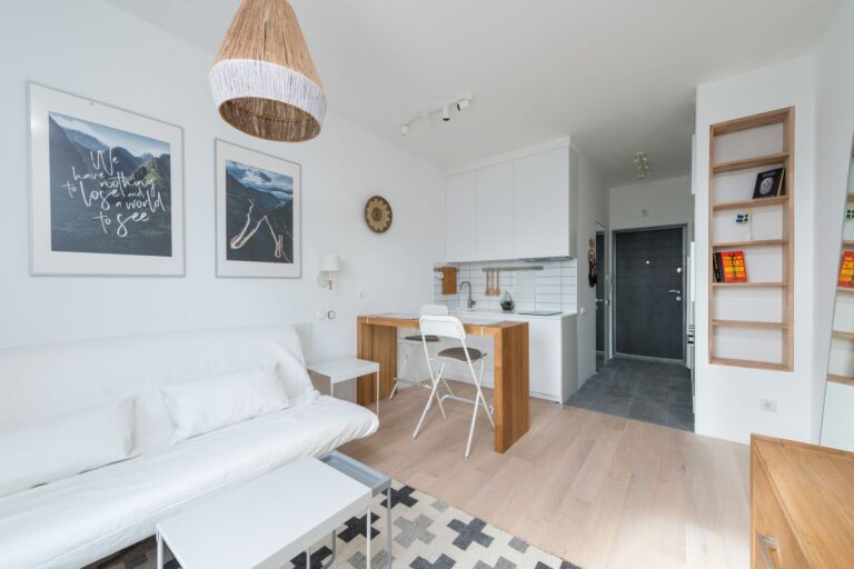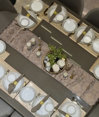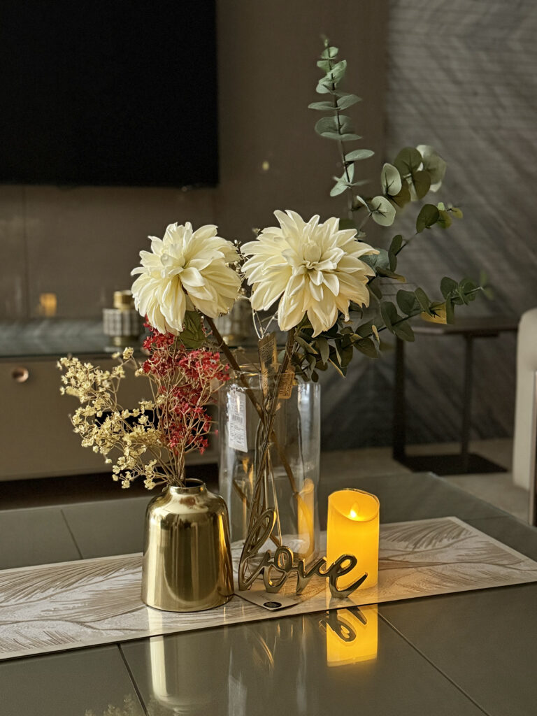

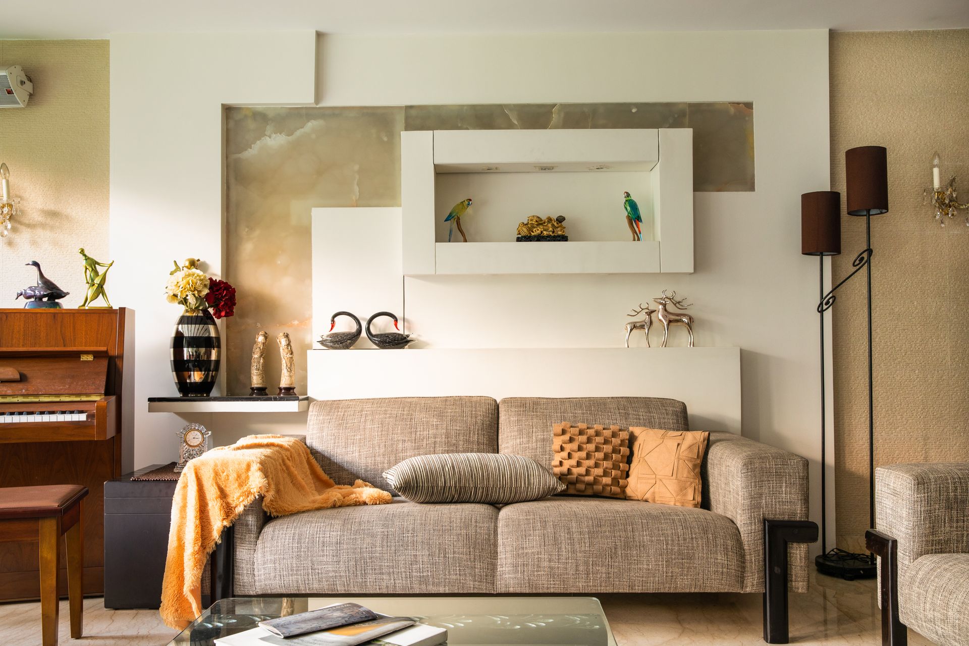
Choosing a hall colour combination is the one decision that changes a room more than any furniture you buy — and it is also the one people get stuck on longest, because a shade that looks calm on a paint chip can turn grey, green or sickly yellow once it is on four walls in Indian daylight.
Below are nine living room palettes that hold up in real Indian homes, with the exact shades, where each one works best, and the mistakes that quietly ruin an otherwise good scheme.
First, the rule that makes any palette work
Before the colours themselves: almost every hall that feels “off” has broken the 60-30-10 rule.
- 60% — your dominant colour. Walls, and usually the largest rug.
- 30% — your secondary. Sofa, curtains, a feature wall.
- 10% — your accent. Cushions, art, a lamp, a vase.
The common mistake is making the accent colour 30% of the room. Three mustard cushions look considered; a mustard sofa, mustard curtains and mustard art look like a showroom. Keep the loud colour small and the room reads expensive.
9 hall colour combinations that work in Indian homes
1. Warm ivory + terracotta + walnut
#F3EDE4 · #C17F5E · #4A3728
The safest premium palette there is. Warm ivory keeps a small hall open, terracotta gives it warmth without going orange, and walnut furniture grounds the whole thing. Works in almost any light, which is why it is the default in most Indian apartments that look “done”.
2. Sage green + cream + cane
#9CAA92 · #F7F4EE · natural cane
Best for halls that get strong afternoon sun, because sage absorbs glare instead of bouncing it back at you. Pair it with cane or rattan rather than dark wood — heavy timber makes sage look muddy.
3. Off-white + indigo + brass
#FAF7F2 · #2B3A67 · antique brass
Indigo is the one deep colour that reads Indian without reading themed. Use it on one wall or on the sofa, never both. Brass handles, a brass floor lamp or brass frames stop it feeling cold.
4. Soft grey + mustard + charcoal
#DEDBD6 · #C8912F · #3A3A3A
For north-facing halls that never get direct sun. Pure grey alone goes flat and cold in low light; mustard is what rescues it. Keep the mustard to cushions and one piece of art.
5. Beige + olive + black
#E7DFD2 · #6B7150 · #1A1A1A
Beige gets a bad name because it is usually used alone. Give it an olive and a hard black line — a black window frame, a black lamp base — and it stops being bland immediately.
6. Cream + deep teal + gold
#F5F0E6 · #14524F · brushed gold
The palette for a hall you want to feel formal — for guests, for festivals. Teal is deep enough to feel rich but is far more forgiving than navy in warm Indian light.
7. Sand + rust + oak
#E5D9C6 · #A6522C · light oak
Warmer and earthier than the ivory scheme, and very good in homes with a lot of natural texture — jute, clay, handloom. Avoid if your flooring is a cool grey tile; sand and cool grey fight each other.
8. White + blush + chocolate
#FFFFFF · #E3C4BC · #4B342A
Blush reads as a neutral once you put a genuinely dark brown next to it. Without that dark anchor it drifts into looking like a nursery — the chocolate is not optional.
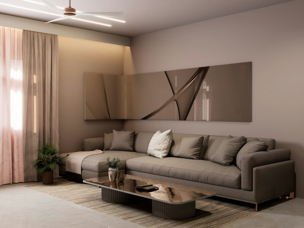
9. Greige + navy + natural linen
#D9D2C7 · #1F2A44 · undyed linen
Greige — grey with a warm base — is the most useful wall colour in India, because it survives both harsh noon light and warm evening bulbs without shifting. Navy gives it a spine.
How your light decides the colour, not the paint chip
This is the part that costs people a repaint. The same shade behaves differently depending on which way your hall faces:
- North-facing — cool, indirect light all day. Cool greys and blues go flat here. Choose warm-based neutrals (greige, ivory, sand).
- South-facing — strong, warm light. You can afford cooler colours: sage, teal, soft grey.
- East-facing — bright mornings, dull evenings. Warm accents keep it alive after 4pm.
- West-facing — hot orange light in the evening. Avoid anything already yellow or peach, or it will glow.
Test any shortlisted shade by painting an A4-size patch on two different walls and looking at it at 10am, 4pm and at night under your own bulbs. Warm white LEDs shift colours dramatically — a palette chosen only in daylight can look completely different once the lights are on.
If you are renting, or not repainting
You do not need to touch the walls to change a hall’s colour scheme. In most rented flats the walls are already off-white or builder-beige, which is a perfectly good 60%. You are choosing the other 40%:
- Curtains are the single biggest colour surface after the walls — change these first.
- A large rug anchors the palette and covers flooring you did not choose.
- Cushion covers and throws carry the accent, and cost the least to change again next year.
- Art and frames set the darkest note, which is what stops a neutral room feeling washed out.
Done in that order, a hall changes completely without a single contractor, a single drill hole, or anything you cannot take with you when you move.
Three mistakes that ruin a good palette
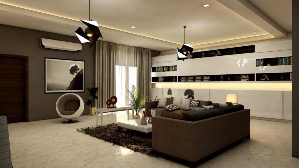
- Matching everything. A sofa, curtains and rug in the same shade flattens a room. Vary the tone, keep the colour family.
- No dark note. Every neutral scheme needs one genuinely dark element or it looks unfinished. It can be as small as a black lamp.
- Too many undertones. A warm beige wall next to a cool grey sofa next to a yellow-toned wood floor is three schemes fighting. Pick warm or cool and stay there.
Want this decided for you?
Picking a palette is genuinely hard to do from a paint chart, because it depends on your light, your existing furniture and the flooring you are stuck with. That is most of what we do.
Styora Decors is an interior styling and decor studio working with homes across India — layout, colour, furnishings, art and the finishing touches, without any construction. No contractors, no dust, no three-month timeline. We work with the space you already have. Plans start at ₹10,000.
Book a free 15-minute consultation → Tell us which way your hall faces and what you already own, and we will tell you honestly whether styling is the right answer for it.