

By Styora Decors | Interior Styling & Decor | 9 min read
You painted the bedroom a colour you loved on the shade card. Now it feels either too loud to sleep in or too dull to wake up to.
The right bedroom colour combination is the one that still feels calm at 11 pm under a warm bulb and fresh at 7 am in daylight. In a bedroom, colour isn’t only the walls: the bedding, curtains, rug and headboard wall together make up the palette you actually see from the pillow.
Below are ten palettes that work in Indian bedrooms, each broken into wall, bedding, curtains, rug and accent. One honest note: repainting needs a painter. Everything else here is pure styling, and you can shift a bedroom’s whole palette with soft furnishings alone, with no renovation at all.
Before you pick: light, size and the 60-30-10 rule
Three things decide whether a palette works in your bedroom, long before you choose a shade.
- Which way the window faces. North- and east-facing bedrooms get cooler, softer light, so warm whites and earthy tones keep them from looking grey. South- and west-facing rooms get strong afternoon sun, so cooler greens and blues help them feel restful.
- The size of the room. In a compact bedroom, keep the walls light and bring depth through bedding and a rug. A large master bedroom can carry a deeper wall colour without closing in.
- Your climate. In humid cities, very pale fabrics show monsoon damp and dust quickly. Mid-tone bedding in oatmeal, sage or dusty blue is far more forgiving than pure white.
Then use the 60-30-10 rule. Sixty per cent is your main colour (usually walls and large furniture), thirty per cent is the supporting colour (bedding, curtains, rug) and ten per cent is the accent (cushions, a throw, art, a lamp). Wood, cane and metal finishes sit outside the count.
10 bedroom colour combination ideas for calm rooms
Each palette lists the full room, so you can copy it or borrow one layer at a time.
1. Warm white, oatmeal and terracotta
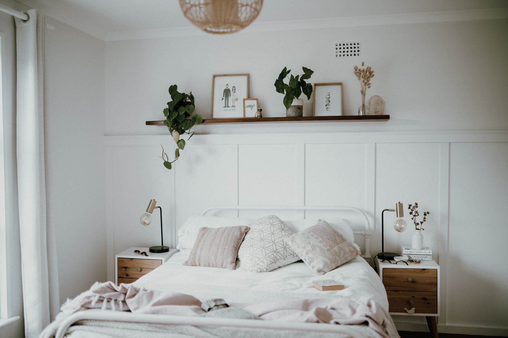
The easiest palette for almost any Indian bedroom. Walls: warm white. Bedding: oatmeal or natural linen with a terracotta throw. Curtains: warm white sheers with lined cotton. Rug: jute or an ivory dhurrie. Accent: terracotta cushions and a clay or brass lamp. It reads warm in daylight and glows at night.
2. Sage, cream and natural wood 🌿
A quiet, nature-led look. Walls: soft sage on the headboard wall, cream on the rest. Bedding: cream with a sage or olive quilt. Curtains: unbleached cotton. Rug: a cream flatweave. Accent: teak or sheesham furniture, cane, a couple of plants. Green and wood is one of the most restful pairings you can choose.
3. Dusty blue, white and brass
Cool and fresh, made cosy with metal. Walls: white or a very pale blue-grey. Bedding: dusty blue with white, perhaps an indigo block print. Curtains: white linen. Rug: blue-and-ivory. Accent: a brass bedside lamp and brass frames. Ideal for west-facing bedrooms that heat up in the afternoon.
4. Greige and blush
Soft and grown-up rather than girly. Walls: greige, a grey-beige that sits between warm and cool. Bedding: white with a blush or dusty pink throw. Curtains: greige or oatmeal. Rug: a soft grey or beige. Accent: blush cushions and a warm wood side table. Keep the pink to the 30 per cent and below, never on the walls as well.
5. Deep green headboard wall with rust
For people who want drama without darkness. Walls: bottle or forest green behind the bed only, warm white on the rest. Bedding: ivory with rust or ochre cushions. Curtains: natural linen. Rug: a rust-toned kilim or dhurrie. Accent: brass and walnut. This one needs a painter for the feature wall; the rest is styling.
6. Ivory, taupe and charcoal
Calm, tailored and very hotel-like. Walls: ivory. Bedding: taupe and ivory layers with a charcoal throw. Curtains: taupe blackout. Rug: a charcoal-and-ivory pattern. Accent: black metal lamps and frames. Good for city flats where street light leaks in, since the darker curtain blocks it.
7. Lavender grey and white
Gentle and airy for smaller rooms. Walls: a pale lavender-grey. Bedding: crisp white with a lilac or mauve quilt. Curtains: white sheers. Rug: soft grey. Accent: silver or white ceramic. A barely-there purple reads as calm, not childish.
8. Mustard, white and indigo
Bright, happy and very Indian. Walls: white. Bedding: indigo block print with mustard cushions. Curtains: white cotton. Rug: an indigo or blue dhurrie. Accent: mustard throw, cane or rattan. Mustard and indigo is a classic textile pairing, and it keeps a bedroom cheerful without overstimulating it.
9. Beige, brown and cane
Warm, earthy and low-maintenance. Walls: sand or beige. Bedding: white with a chocolate or coffee-brown throw. Curtains: beige linen. Rug: jute. Accent: cane headboard or bedside, a woven basket. Add one dark element, such as black frames, so the room doesn’t blur into one shade.
10. Soft peach and teal
A brighter option for guest rooms or a teenager’s room. Walls: soft peach or apricot. Bedding: white with teal cushions and throw. Curtains: white or pale peach. Rug: a teal-and-ivory pattern. Accent: brass or gold. Peach is warm and welcoming; teal stops it looking sugary.
If you’re working on the living room too, our hall colour combination palettes follow the same logic, so the two rooms flow into each other.
Two colour combination for bedroom walls
A two-colour wall scheme is the most popular way to add character without overwhelming the room. The simplest approach is a headboard wall: the wall behind the bed in a deeper colour, the other three in a light neutral from the same family.
- Sage headboard wall with cream walls.
- Dusty blue headboard wall with white walls.
- Terracotta headboard wall with warm white walls.
- Greige headboard wall with ivory walls.
- Forest green headboard wall with warm white walls.
Keep the deeper colour behind you, not in front of you. You see the wall you face when you lie down far more than the one behind the bed, so a bold colour there can feel restless at night. Painting is a painter’s job, but if you rent or don’t want to paint, a large fabric headboard, an oversized textile hanging or a tall upholstered panel gives you the same two-tone effect with zero wall work.
Changing the palette without repainting
Most of a bedroom’s colour comes from fabric, which means you can change the whole mood in a weekend:
- Bedding first. The bed is the largest surface after the walls. A new duvet cover and quilt shift the entire palette.
- Curtains second. Floor-length curtains in the supporting colour make the room look finished and frame the window.
- A rug third. It anchors the bed and pulls the floor into the scheme. A rug that runs at least 60 cm beyond each side of the bed looks generous rather than lost.
- Accents last. Cushions, a throw, a lampshade and one framed print in your accent colour tie it together.
Lighting changes colour too. Warm-white bulbs (2,700–3,000K) flatter warm palettes; cooler bulbs can make greige and sage look grey and flat. Our guide to home lighting design explains how to layer lamps so colours look right at night. For the rest of the bedroom, from bed placement to storage, see our master bedroom design ideas.
✨ Stylist’s tip
Before you commit to a palette, lay your actual fabrics on the bed and look at them twice: once in morning daylight and once at night under your bedside lamp. Bedrooms are mostly used after dark, and a colour that looks fresh at noon can turn muddy under a warm bulb. Choose the combination that still looks good at night.
If you’d rather have someone build the palette for you, from the moodboard to ready-to-buy links, our home styling plans start at ₹10,000 for a 1BHK.
Best colour combination for bedroom sleep and calm
There is no single “best” colour for sleep, but some general patterns help most people unwind:
- Muted beats bright. Softened, slightly greyed colours (sage instead of lime, dusty blue instead of royal blue) feel calmer.
- Low contrast near the bed. Keep the strongest contrasts away from the pillow area.
- Warm neutrals are the safest base. Ivory, oatmeal, sand and greige suit nearly every light direction and person.
- Save energetic colours for small doses. Red, orange and bright yellow work as cushions or a single print, not as whole walls.
Some families also follow vastu colour traditions for the bedroom, such as preferring soft earthy or pastel tones. If that matters in your home, it fits easily into any of the muted palettes above.
Kids’ rooms and guest bedrooms
For children’s rooms, use a calm base (white, cream or pale grey) and let colour come through bedding, a rug and wall art that can change as they grow. Bright walls get outgrown within a few years; a duvet cover is cheap to swap.
For guest bedrooms, choose a palette that works for anyone: warm white with oatmeal and one accent such as sage or dusty blue. Crisp white bedding makes a guest room feel like a well-kept hotel.
Common mistakes to avoid
- Choosing paint from a tiny chip. Colours look much stronger on four walls. Test a large patch on two walls and view it day and night.
- Matching bedding to the wall exactly. The bed disappears. Go a shade lighter or darker, or change the texture.
- Too many accent colours. One accent, used in two or three places, looks styled. Three accents look random.
- Mixing warm and cool undertones. A cool grey wall with yellow-toned wood and cream bedding fights itself. Pick warm or cool and stay there.
- Forgetting the ceiling and floor. A stark white ceiling over a warm room, or a red-toned floor under a blue palette, changes everything. Plan around them.
FAQs
What is the best colour combination for a bedroom?
Warm white with oatmeal and one muted accent (terracotta, sage or dusty blue) suits most Indian bedrooms because it works in any light and with most floors. If you want more colour, sage with cream and wood, or dusty blue with white and brass, are both calm and easy to live with.
Which two colour combination is good for bedroom walls?
Pair a deeper shade on the headboard wall with a light neutral from the same family on the other walls: sage with cream, dusty blue with white, terracotta with warm white, or greige with ivory. Keeping both colours in one undertone family makes the room feel planned rather than patchy.
Which colour is good for a small bedroom?
Light, warm neutrals such as warm white, ivory, pale greige or very soft sage make a small bedroom feel more open. Bring depth through mid-tone bedding, curtains and a rug instead of dark walls. Floor-length curtains hung close to the ceiling also make the room look taller.
Can I change my bedroom colour combination without painting?
Yes. Change the bedding first, then the curtains, then the rug, then the cushions and art. Together they account for most of the colour you see from the bed. A fabric headboard or large textile hanging can also add a second colour to the wall with no paint or drilling.
Want a bedroom palette that feels calm every night — without renovation?
Book a free 15-minute demo call with Styora Decors. Zero obligations — we’ll understand your space and recommend the right plan.
Follow @styoradecors on Instagram and Styora Decors on YouTube for styling reels, colour ideas and room makeovers for Indian homes.


